Lobee brand identity guidelines — logos, colours, typography and graphic elements for consistent communication.
The logotype is the primary visual identifier of the brand. Each variant is designed for a specific use case — digital, print, or social media.
Logotype
Wordmark only — no symbol. Use: headers, documents, contexts where the symbol is already visible.

Symbol
Graphic symbol — no text. Use: favicon, app icon, social media profile picture, stamps.
Full logo horizontal
Symbol + logotype side by side. Preferred variant for most uses — web, banners, presentations.
Full logo vertical
Symbol above logotype. Use: square formats, roll-up banners, exhibition stands, profile images.
Logotype + web address
Wordmark with domain "Lobee.cz". Use: print materials, business cards, leaflets.

Full logo + web address
Symbol, logotype and domain "Lobee.cz". Most complete variant — ads, outdoor media.
Favicon / App Icon
Symbol on white background. Use: browser favicon, Apple Touch Icon, PWA icon, bookmarks.
Size variants
Browser preview
Lobee – AI receptionist✕Favicon active on lobee.czUsage rules
Always maintain a clear zone of at least 2× the X-height of the logotype
Minimum logo width: 80 px (digital), 20 mm (print)
Do not recolour the logo outside approved variants
Do not distort, rotate, or apply drop shadows
The primary accent is Electric Blue #2551F7. Magenta is reserved exclusively for the most important CTA. Violet is decorative only. Click any value to copy it.
02.1 — Primary palette
Background colours
Rich Black
Base background
Dark Void
Panels / Inputs
Deep Navy
Cards / Sidebar
Accent colours
Electric Blue
CTA / Links / Actions
Magenta Pink
Critical CTA / Campaigns
Royal Violet
Gradients / Decorative
Soft Lavender
Light background / Text
02.2 — Secondary palette
Indigo Blue
Dark complementary accent
Bright Purple
Transition tone
Orchid Pink
Mid Magenta
Soft Purple
Muted Violet
Sky Blue
Light accent
02.3 — Brand gradients
Brand Hero
Hero sections, CTA banners
Creative
Creative / campaign gradient
Premium
Dark cards, presentations
Sidebar
App navigation panel
Light
Email templates, light banners
02.4 — Colour rules
Electric Blue = standard interaction
Buttons, links, active navigation, focus ring. 30% of visual. Never for decorative elements.
Magenta = critical CTA only
One element per page — login, purchase. Never in navigation, tables, or cards.
Violet = decorative elements
Gradients, graphic elements, background graphics. 10% of visual. Never as an interactive element.
Lobee's primary typeface is Poppins — modern, friendly and highly readable.
Poppins
Google Fonts — sans-serif
Typeface
Aa Bb Cc
ABCDEFGHIJKLMNOPQRSTUVWXYZ
abcdefghijklmnopqrstuvwxyz
0123456789 !@#$%&*()
Aa
400
Regular
AI voicebot for hotels that speaks the language of your guests.
Body text, labels, meta information
Aa
500
Medium
Lobee automates communication, increasing guest satisfaction.
Emphasis in text, buttons, navigation
Aa
600
SemiBold
Instant replies 24/7. Multilingual communication.
Subtitles, cards, sections
Aa
700
Bold
AI assistant for your hotel.
H3–H4 headings, badge text
Aa
800
ExtraBold
Lobee
Main headings H1–H2, hero titles
Source
Google Fonts — no licence fee
03.3 — Rules
→ Headings: ExtraBold 800, line-height 1.1–1.2
→ Body text: Regular 400, line-height 1.6–1.8
→ Navigation, buttons: SemiBold 600, uppercase, letter-spacing
→ Never use italic for UI elements
→ Minimum text size: 12 px (digital), 8 pt (print)
→ Primary text colour: #FFFFFF (dark) / #07080C (light)
The brand name has precise rules. Always use one of the approved variants.
✓ Correct
Lobee
Preferred variant
lobee.cz
Domain format
lobee.sk
Slovak domain
Lobee.cz
At the start of a sentence / headline
✗ Incorrect
LOBEE
Do not write in all caps
Lobby
Do not confuse with hotel lobby
lobee
Do not start with lowercase in running text
LoBee
CamelCase is not permitted
Legal name
In legal documents, contracts and invoices always use the exact registered name of the operator.
Modern, friendly and trustworthy. Technology that simplifies work and enhances the guest experience.
Technological
Advanced AI — delivered simply
Friendly
Natural communication with guests
Trustworthy
24/7 reliability without downtime
Innovative
Ahead of the competition
05.2 — Key benefits
Instant replies 24/7
Guests never wait for an answer — the bot responds immediately, even at night.
Multilingual communication
Lobee speaks the guest's language — English, Czech, German and many more.
Less work for reception
Routine queries are handled automatically by Lobee. Reception can focus on personal service.
Happy guests
Better communication = better reviews. Direct impact on TripAdvisor and Booking scores.
Lobee's graphic system is built on rounded shapes, a gradient accent and an audio waveform as the communication icon.
Rounded corners
Lobee uses rounded corners (8–16 px) for cards, buttons and UI elements. A symbol of friendliness — distinguishing it from strict geometry.
Brand gradient
Violet → Blue → Light Blue gradient for primary CTA elements, icons, illustrations and highlights.
Audio waveform
Icon of the AI voice assistant. The animated version is used to visualise active listening / bot speaking.
Chat UI
Chat bubbles: bot on the left (dark), guest on the right (gradient). Rounded corners emphasise a friendly tone.
Buttons
Primary: gradient fill. Secondary: outline with Violet border. Third level: dark ghost.
Badges / Tags
Pill / rounded-full style. Colour by context: Violet primary, green status, blue info.
Dark variant
AI voicebot for hotels
Dark background + gradient accent + white text = premium digital look.
Light variant
AI voicebot for hotels
Light background for print materials, brochures, banners and emails.
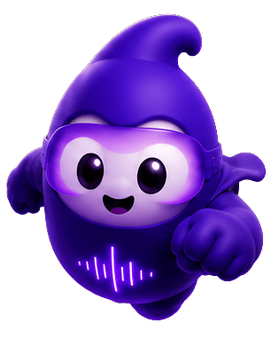
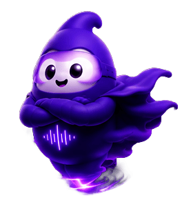
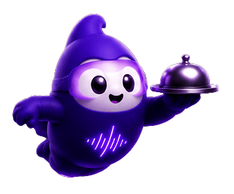
Lobee mascot — 3D character in individual variants. Used in onboarding, empty states, notifications and marketing materials.
Default — Basic
Superhero — Cape
Concierge — Tray
Lobee Design Manual
Internal document GM Media s.r.o. — 2026
Lobee visual identity — all rights reserved.
Documentation maintained by the GM Media s.r.o. team.